
Introduction
In this blog post, we'll delve into the functionalities and implementation of the QuickGrid Blazor Component. QuickGrid, developed by the Blazor team, is a straightforward and efficient grid component designed for Blazor applications.
Overview
QuickGrid is a lightweight, customizable grid component specifically designed for Blazor applications. It comes with built-in features such as sorting, filtering, and pagination, making it a robust tool for displaying and managing data in Blazor applications.
Purpose and Goals
QuickGrid aims to provide a convenient, simple, and flexible data grid component for Blazor developers, covering the most common needs. It serves as a reference architecture and performance baseline for those building Blazor data grid components.
Use and Benefits
QuickGrid focuses on core grid functionality, emphasizing performance, accessibility, internationalization (including RTL languages), and extensibility. While it may not include all features found in commercial grids, it excels in essential grid functions.
Features
Supports In-Memory, EF-Core, and Remote Data Sources.
Offers two built-in column types: PropertyColumn and TemplateColumn.
Enables sorting, filtering, paging, and virtualization.
Allows custom styling of the grid.
Way of Implementation
To implement QuickGrid in any Blazor hosting model (Server, Web Assembly, or .NET MAUI), follow these steps:
Add the Microsoft.AspNetCore.Components.QuickGrid package to your .NET 8 project.
Begin using QuickGrid in your application.
Implementation Example
Below is a simple program demonstrating the implementation of QuickGrid:
@using Microsoft.AspNetCore.Components.QuickGrid;
<div class="col-6">
<div class="grid">
<QuickGrid Items="@Items" Class="table table-striped" Pagination="PaginationState">
<a target="" data-router-slot="disabled" href="http://p.Name" type="external">p.Name</a>)" Sortable="true" IsDefaultSortColumn="true" InitialSortDirection="SortDirection.Ascending" />
<TemplateColumn Title="Status" Sortable="true" SortBy="StatusGridSort" Class="Label">
<ChildContent>
@context.Status
</ChildContent>
<ColumnOptions>
<div class="search-box">
<input type="search" autofocus class="form-control" @bind-value="@statusFilterVal" @oninput="((e) => FilterData(e))" placeholder="Status" />
</div>
</ColumnOptions>
</TemplateColumn>
</QuickGrid>
</div>
<SummaryTemplate>
@if (_userInfoList?.Count > 0)
{
@{
var data = Items?.Count() == _userInfoList.Count ? _userInfoList : Items?.ToList();
var itemsPerPage = (PaginationState.CurrentPageIndex * PaginationState.ItemsPerPage);
var currentPageItemCount = Math.Min(itemsPerPage + PaginationState.ItemsPerPage, data.Count);
var startCount = data?.Count > 0 ? (itemsPerPage + 1) : 0;
}
<span>Showing @startCount to @currentPageItemCount of @Items?.Count() entries</span>
@if (Items?.Count() < _userInfoList.Count)
{
<span> (filtered from @_userInfoList?.Count total entries)</span>
}
}
else
{
Showing 0 to 0 entries
}
</SummaryTemplate>
</Paginator>
</div>
@code {
private List<UserInfoModel> _userInfoList { get; set; }
public IQueryable<UserInfoModel>? Items { get; set; }
private GridSort<UserInfoModel> StatusGridSort = GridSort<UserInfoModel>.ByAscending(x => x.Status);
private string? statusFilterVal;
private PaginationState PaginationState = new PaginationState { ItemsPerPage = 10 };
protected override void OnInitialized()
{
SetItems();
}
private void SetItems()
{
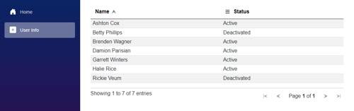
_userInfoList = new List<UserInfoModel>() {
new UserInfoModel { Name = "Ashton Cox", Status = "Active" },
new UserInfoModel { Name = "Brenden Wagner", Status = "Active" },
new UserInfoModel { Name = "Garrett Winters", Status = "Active" },
new UserInfoModel { Name = "Betty Phillips", Status = "Deactivated" },
new UserInfoModel { Name = "Damion Parisian", Status = "Active" },
new UserInfoModel { Name = "Rickie Veum", Status = "Deactivated" },
new UserInfoModel { Name = "Halie Rice", Status = "Active" }
};
Items = _userInfoList.AsQueryable();
}
private void FilterData(ChangeEventArgs e)
{
var status = e.Value?.ToString();
SetItems();
if (!string.IsNullOrEmpty(status))
Items = Items?.Where(x => x.Status.Contains(status, StringComparison.CurrentCultureIgnoreCase));
}
public class UserInfoModel
{
public string Name { get; set; } = string.Empty;
public string Status { get; set; } = string.Empty;
}
}
Overview Property of Components
QuickGrid – Root Level component to render table.
Items – Take Input as IQueryable<T> Type. Where T is class of our data.
Class – Any CSS Class
Pagination – If you want to add Pagination.
Property Column – For rendering Table header and Table Data.
Title – To display Table Header
Property – Class Property which we want to bind for that column.
Sortable – bool – 'true' to enable sorting of that column. Default is 'false'.
IsDefaultSortColumn – bool – true to set that column is default sort column default is false.
InitialSortDirection – Enum – SortDirection.Ascending for sort ascending, SortDirection.Descending to sort in descending order.
Column Option – To display popup menu.
Template Column – For rendering a column with customization.
Title – To display table header
Sortable – bool – true for enable sorting.
SortBy – GridSort<T> - To provide custom sorting for Template column.
Child Content – Template for table data column.
Column Option – To display popup menu.
Exciting finding
Here, as the user types into the search box, it triggers a refresh of the items and binds the value in real-time. This process filters the data based on the conditions applied within the items.
<input type="search" autofocus @bind="nameFilter" @bind:event="oninput"
 placeholder="Country name..." />
@Code {
IQueryable<Country>? FilteredItems => items?.Where(x => <a target="" data-router-slot="disabled" href="http://x.Name" type="external">x.Name</a>.Contains(nameFilter, StringComparison.CurrentCultureIgnoreCase));
}
Conclusion
QuickGrid is a powerful tool for Blazor developers seeking a lightweight and customizable grid component. By following the outlined steps, you can efficiently integrate QuickGrid into your Blazor applications and enjoy its core features.
Feel free to explore and build upon QuickGrid, utilizing it as a foundation for your Blazor data grid components.
Related Reading: When it comes to performance and scalability, caching is key. In our HybridCache blog, we explain how Hybrid Cache combines the speed of in-memory caching with the scalability of distributed caching.
